Open the page Example



Nia Voss on Bento
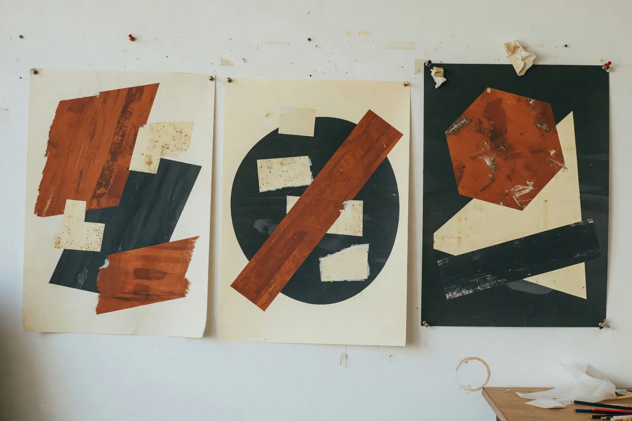
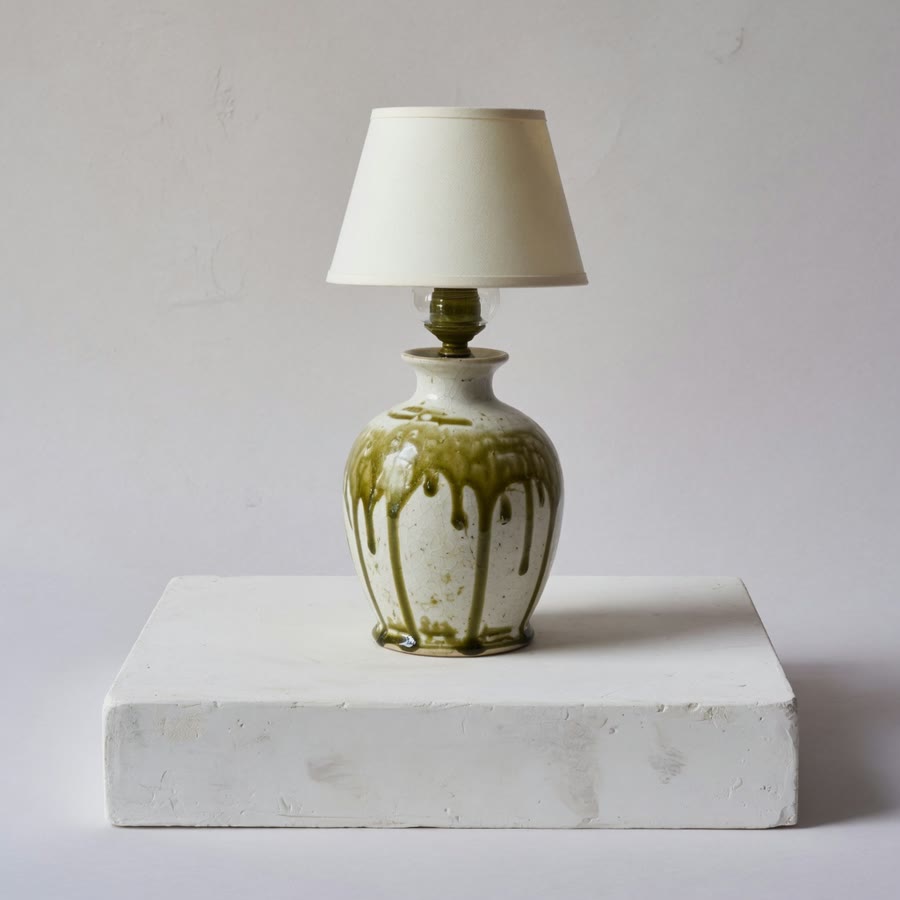
Wide cards for the two main projects, small ones for a lamp, a colour study and the studio name.
Blocks: Text · Project · Image · Email
A bento personal website arranges your content as cards of different sizes, so the important pieces can be big and the small details stay small. It works best when your content varies: a main project, a quick note, a photo, a link. Here are two example pages.
Wide cards for the two main projects, small ones for a lamp, a colour study and the studio name.
Blocks: Text · Project · Image · Email
Projects of similar weight sit side by side. If one project should clearly lead, Minimal may suit you better.
Blocks: GitHub · Text · Contact
The grid both examples use. Drag cards around until the layout fits your work.
Use the Bento templateAbout Bento
You can try it without an account. Publish at sayhi.page/yourname with the personal website builder, or browse all the examples.
Card sizes, the blocks you can add, and how to set up your page.
Yes. In the studio you can drag blocks into a new order and change each card’s size, then preview the grid before you publish.
Example pages for a developer, a photographer, a musician, a designer, and a creator.
A modular grid for projects, objects, and sentences on one personal page.
A bento grid or a large-work page for identity, objects, and selected projects.
Bento.me now redirects to Linktree. SayHi still has the bento grid.